3  Results

This section walks through what we actually see in the 311 data.
Instead of repeating every statistic, we use set of plots where each one is meant to answer a specific question. For each figure, we describe:

Code
library(dplyr)
library(ggplot2)
library(lubridate)
library(stringr)
library(tidyr)
library(forcats)
library(scales)
library(tidytext)
library(ggalluvial)
library(plotly)
theme_report <- function(base_size = 13) {
  theme_minimal(base_size = base_size) +
    theme(
      panel.grid.minor = element_blank(),
      panel.grid.major = element_line(color = "grey90", linewidth = 0.3),
      plot.title       = element_text(face = "bold", size=13,hjust = 0.5),
      plot.subtitle    = element_text(hjust = 0.5, size = 11),
      axis.title.x     = element_text(margin = margin(t = 8)),
      axis.title.y     = element_text(margin = margin(r = 8)),
      legend.title     = element_text(face = "bold"),
      legend.position  = "right"
    )
}

3.1 How many complaints are received over time? Which months are the busiest?

Code
df_clean_final <- readRDS("df_clean_final.rds")
complaints <- df_clean_final |>
  mutate(
    year = year(created_date),
    month = month(created_date, label = TRUE, abbr = TRUE),  # Jan, Feb, etc.
    month_num = month(created_date),  # 1, 2, 3, etc.
    year_month = floor_date(created_date, "month")  # First day of each month
  )
complaints_summary <- complaints |>
  filter(!is.na(year)) |>    
  group_by(year, month, month_num) |>
  summarise(total_complaints = n(), .groups = "drop") |>
  arrange(year, month_num)


plot3 <- ggplot(complaints_summary, 
                aes(x = month_num, y = total_complaints, 
                    color = factor(year), group = year)) +
  geom_line(size = 1.2) +
  geom_point(size = 3) +
  scale_x_continuous(breaks = 1:12, labels = month.abb) +
  scale_y_continuous(
    limits = c(220000, 320000),
    breaks = seq(220000, 320000, by = 10000),
    labels = scales::comma
  ) +
  scale_color_brewer(palette = "Dark2", name = "Year") +
  labs(
    title = "Complaint Trends Across Months",
    x = "Month",
    y = "Total Complaints"
  ) +
  theme_report()
print(plot3)

Observations:

  • February sees the lowest volume of complaints in both years.
  • The months of June, September , December in 2024 see the highest volume of complaints.
  • Opposite trend is observed in 2023 where May, July, October see the highest volume of complaints.
  • There is no clear seasonal pattern across the two years, suggesting that complaint volume is influenced by factors other than just time of year.

3.2 Which complaint types are most common in NYC?

There were a unique total of 300 complaint types reported in the dataset. The complaint were bucketed into the following categories for better analysis: Noise Related, Heat/Water/Gas Issues, Buildings and Housing, Sanitation and Waste, Street and Traffic Conditions, Public Safety / Crime / Quality of Life, Vehicle and Parking, Utilities and Power, Pests and Animals, Others / Miscellaneous.

Code
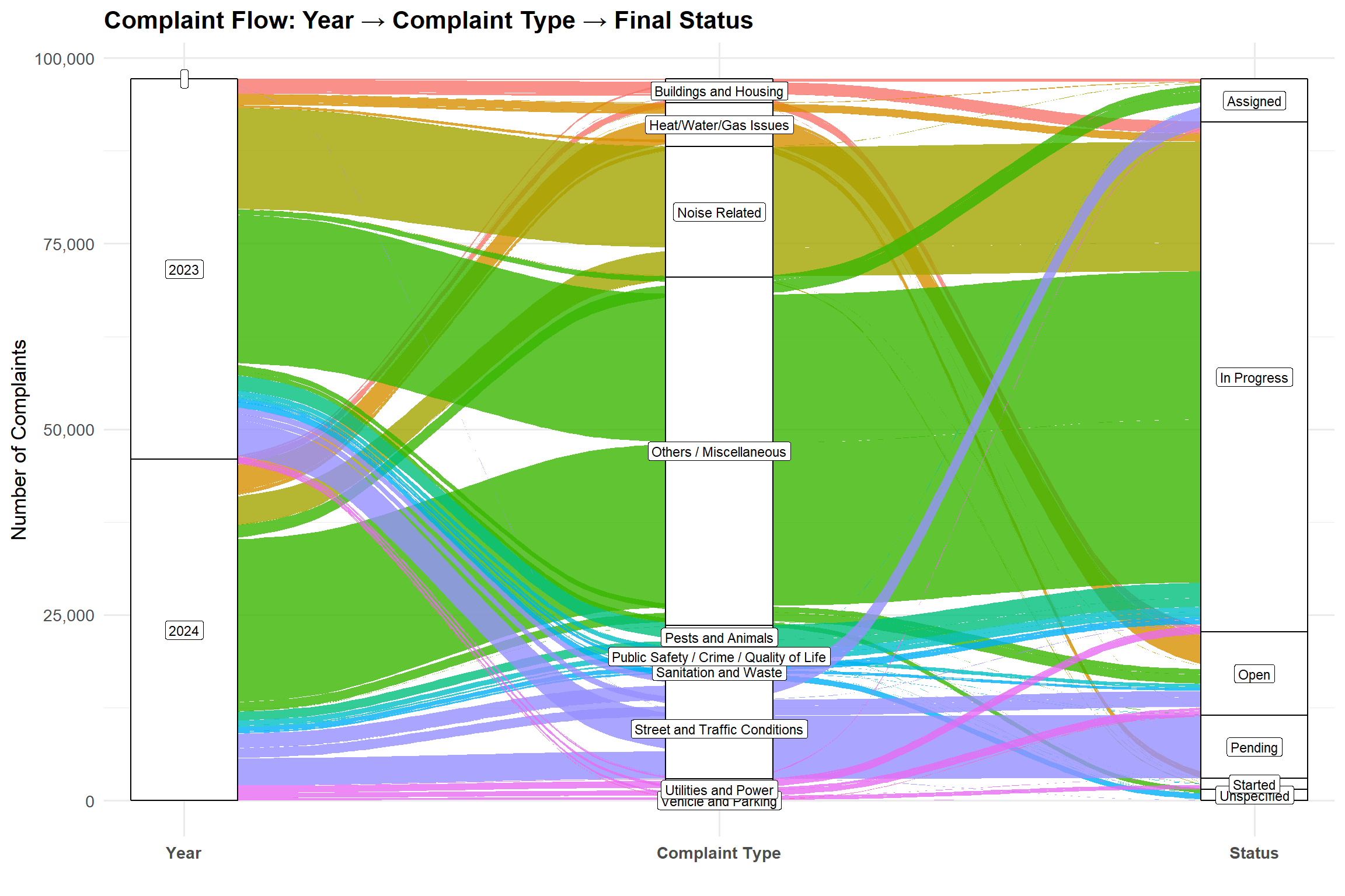
complaint_category_mapping <- list(
  "Noise Related" = c(
    "Noise - Residential", "Noise - Street/Sidewalk", "Noise - Commercial",
    "Noise", "Noise - Vehicle", "Noise - Helicopter", "Noise - Park",
    "Noise - House of Worship"
  ),
  
  "Heat/Water/Gas Issues" = c(
    "HEAT/HOT WATER", "Water System", "WATER LEAK", "PLUMBING",
    "Water Leak", "Drinking Water", "Water Quality", "Water Maintenance",
    "Water Drainage", "Drinking Water General", "Drinking Water Tank",
    "Drinking Water Conservation", "Bottled Water", "DEP Sidewalk Condition",
    "Non-Residential Heat", "Heat/Hot Water"
  ),
  
  "Buildings and Housing" = c(
    "PAINT/PLASTER", "DOOR/WINDOW", "FLOORING/STAIRS", "APPLIANCE",
    "Elevator", "Lead", "SAFETY", "Indoor Air Quality", "Plumbing",
    "Boilers", "Electrical", "ELEVATOR", "Asbestos", "Paint/Plaster",
    "Door/Window", "OUTSIDE BUILDING", "Wood Pile", "Mold",
    "Flooring/Stairs", "Appliance", "Scaffold Safety", "Electric",
    "Unstable Building", "Window Guard", "Cooling Tower", "Peeling Paint",
    "Facade Insp Safety Pgm", "Outside Building"
  ),
  
  "Sanitation and Waste" = c(
    "UNSANITARY CONDITION", "Dirty Condition", "Missed Collection",
    "Residential Disposal Complaint", "Litter Basket Request",
    "Commercial Disposal Complaint", "Litter Basket Complaint",
    "Sanitation Worker or Vehicle Complaint", "Dumpster Complaint",
    "Industrial Waste", "Seasonal Collection", "Institution Disposal Complaint",
    "Transfer Station Complaint", "DSNY Internal"
  ),
  
  "Street and Traffic Conditions" = c(
    "Street Condition", "Traffic Signal Condition", "Street Light Condition",
    "Sidewalk Condition", "Curb Condition", "Street Sign - Damaged",
    "Street Sign - Missing", "Street Sign - Dangling", "Highway Condition",
    "Highway Sign - Damaged", "Highway Sign - Missing", "Highway Sign - Dangling",
    "Bridge Condition", "Tunnel Condition", "DEP Highway Condition",
    "DEP Street Condition"
  ),
  
  "Public Safety / Crime / Quality of Life" = c(
    "Homeless Person Assistance", "Encampment", "Non-Emergency Police Matter",
    "Drug Activity", "Graffiti", "Illegal Fireworks", "Panhandling",
    "Animal-Abuse", "Violation of Park Rules", "Illegal Posting",
    "Hazardous Materials", "Smoking", "Unleashed Dog", "Urinating in Public",
    "Disorderly Youth", "Squeegee", "Quality of Life", "Face Covering Violation"
  ),
  
  "Vehicle and Parking" = c(
    "Illegal Parking", "Blocked Driveway", "Abandoned Vehicle",
    "Derelict Vehicles", "Broken Parking Meter", "Municipal Parking Facility"
  ),
  
  "Utilities and Power" = c(
    "ELECTRIC", "Sewer", "Root/Sewer/Sidewalk Condition", "Radioactive Material",
    "X-Ray Machine/Equipment", "Oil or Gas Spill"
  ),
  
  "Pests and Animals" = c(
    "Rodent", "Animal in a Park", "Unsanitary Pigeon Condition",
    "Harboring Bees/Wasps", "Illegal Animal Kept as Pet", "Mosquitoes",
    "Pet Shop", "Poison Ivy", "Illegal Animal Sold", "Unsanitary Animal Facility",
    "Animal Facility - No Permit", "Unlicensed Dog", "Unsanitary Animal Pvt Property"
  ),
  
  "Others / Miscellaneous" = c(
    "General Construction/Plumbing", "Illegal Dumping", "GENERAL",
    "Damaged Tree", "Maintenance or Facility", "New Tree Request",
    "For Hire Vehicle Complaint", "Overgrown Tree/Branches", "Consumer Complaint",
    "Vendor Enforcement", "Building/Use", "Obstruction", "Air Quality",
    "Dead/Dying Tree", "Dead Animal", "Street Sweeping Complaint",
    "Taxi Complaint", "Lost Property", "Outdoor Dining",
    "Real Time Enforcement", "Mobile Food Vendor", "Bike/Roller/Skate",
    "Chronic", "Special Projects Inspection Team (SPIT)", "Illegal Tree Damage",
    "Electronics Waste Appointment", "Emergency Response Team (ERT)",
    "Food Poisoning", "Smoking or Vaping", "Day Care", "Standing Water",
    "Investigations and Discipline (IAD)", "Remaining Taxi Report",
    "E-Scooter", "BEST/Site Safety", "Indoor Sewage", "For Hire Vehicle Report",
    "Uprooted Stump", "Green Taxi Complaint", "Ferry Inquiry", "Ferry Complaint",
    "Beach/Pool/Sauna Complaint", "Tattooing", "Plant", "Bus Stop Shelter Placement",
    "LinkNYC", "Bus Stop Shelter Complaint", "Posting Advertisement",
    "Taxi Compliment", "AHV Inspection Unit", "Adopt-A-Basket",
    "Cranes and Derricks", "Recycling Basket Complaint", "Found Property",
    "Incorrect Data", "Bike Rack", "Special Natural Area District (SNAD)",
    "Public Toilet", "Dept of Investigations", "Lifeguard", "Special Operations",
    "Dispatched Taxi Complaint", "Boiler", "Bench", "Building Condition",
    "Taxi Licensee Complaint", "Retailer Complaint", "Calorie Labeling",
    "ZTESTINT", "Public Payphone Complaint", "FHV Licensee Complaint",
    "Wayfinding SNW", "Leaning", "Bar", "Building Marshal's Office",
    "Building Marshals office", "DOB Posted Notice or Order",
    "Construction Safety Enforcement", "Tanning", "Executive Inspections",
    "Internal", "Code", "Private School", "Vaccine Mandate Non-Compliance",
    "Dispatched Taxi Compliment", "SRDE", "Stalled Sites",
    "Sustainability Enforcement", "Trans Fat", "Food Establishment",
    "Sewer Maintenance", "Bike Rack Condition", "Construction Lead Dust"
  )
)

# Create a long-format data frame
complaint_mapping_df <- data.frame(
  complaint_type = unlist(complaint_category_mapping),
  category = rep(names(complaint_category_mapping), 
                 sapply(complaint_category_mapping, length)),
  stringsAsFactors = FALSE
)
rownames(complaint_mapping_df) <- NULL
map_complaint_to_category <- function(complaint_type) {
  for (category in names(complaint_category_mapping)) {
    if (complaint_type %in% complaint_category_mapping[[category]]) {
      return(category)
    }
  }
  return("Others / Miscellaneous")
}

# Apply the mapping to create complaint_bucket column
df_clean_final <- df_clean_final |>
  mutate(complaint_bucket = sapply(complaint_type, map_complaint_to_category))

saveRDS(df_clean_final, "df_final.rds") 
 # Save updated data frame
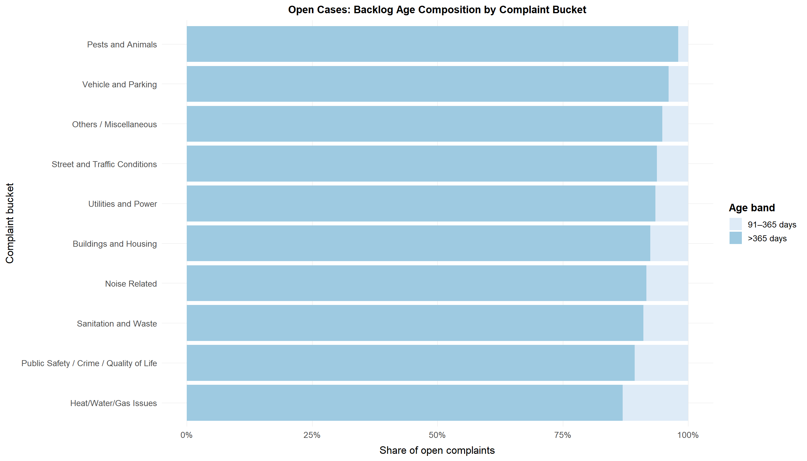
complaint_bucket_counts <- df_clean_final |>
  count(complaint_bucket, sort = TRUE)

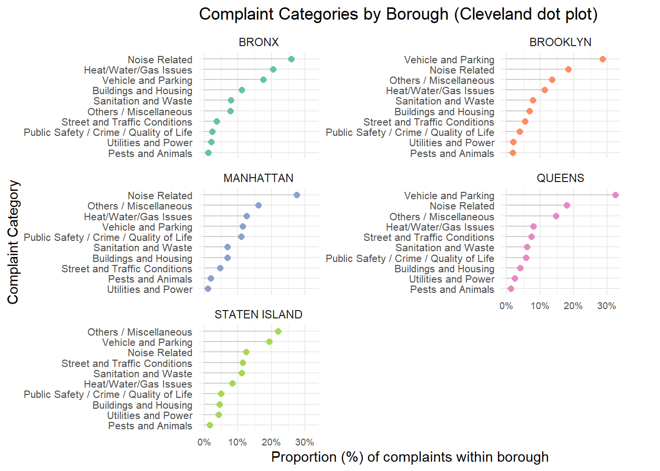
complaint_bucket_borough <- df_clean_final |>
  group_by(borough, complaint_bucket) |>
  summarise(count = n(), .groups = "drop") |>
  group_by(borough) |>
  mutate(
    total_borough = sum(count),
    proportion = count / total_borough * 100
  ) |>
  ungroup()
print(complaint_bucket_borough)
# A tibble: 50 × 5
   borough complaint_bucket                       count total_borough proportion
   <chr>   <chr>                                  <int>         <int>      <dbl>
 1 BRONX   Buildings and Housing                 152187       1365908      11.1 
 2 BRONX   Heat/Water/Gas Issues                 280270       1365908      20.5 
 3 BRONX   Noise Related                         354903       1365908      26.0 
 4 BRONX   Others / Miscellaneous                105631       1365908       7.73
 5 BRONX   Pests and Animals                      14932       1365908       1.09
 6 BRONX   Public Safety / Crime / Quality of L…  32185       1365908       2.36
 7 BRONX   Sanitation and Waste                  107341       1365908       7.86
 8 BRONX   Street and Traffic Conditions          49349       1365908       3.61
 9 BRONX   Utilities and Power                    28127       1365908       2.06
10 BRONX   Vehicle and Parking                   240983       1365908      17.6 
# ℹ 40 more rows

To see how concerns differ across boroughs, we turned these counts into within-borough percentages and plotted them as a Cleveland dot plot, faceted by borough.

Code
# prepare plot data: percent label and reorder within each borough

plot_df <- complaint_bucket_borough |>
  mutate(prop_label = paste0(round(proportion, 1), "%"),
         complaint_bucket = reorder_within(complaint_bucket, proportion, borough, fun = max))

# Cleveland dot-plot showing proportion (%) and ordered by highest per borough
ggplot(plot_df, aes(x = proportion, y = complaint_bucket)) +
  geom_segment(aes(x = 0, xend = proportion, yend = complaint_bucket),
               color = "gray80") +
  geom_point(aes(color = borough), size = 2) +

  facet_wrap(~ borough, scales = "free_y", ncol = 2) +
  scale_x_continuous(labels = function(x) paste0(x, "%")) +
  scale_y_reordered() +
  scale_color_brewer(palette = "Set2") +
  theme_minimal() +
  theme(
    legend.position = "none",
    axis.text.x = element_text(size = 7),
    axis.text.y = element_text(size = 8),
    plot.margin = margin(5, 30, 5, 5) # room for labels
  ) +
  labs(
    title = "Complaint Categories by Borough (Cleveland dot plot)",
    x = "Proportion (%) of complaints within borough",
    y = "Complaint Category"
  ) +
  coord_cartesian(clip = "off")

  • We choose Cleveland dot plot because with ~10 complaint buckets and 5 boroughs, a standard grouped bar chart would be wide and cluttered.
  • A dot plot puts all categories on a shared horizontal scale (0–30%), which makes it easier to compare both within a borough and across boroughs.

What stands out

  • In every borough, Noise Related and Vehicle and Parking are among the top categories by share, often together making up roughly one-third of complaints.
  • Manhattan is particularly noise-heavy, which matches expectations for a dense, mixed-use borough with late-night activity.
  • Staten Island shows relatively more Street and Traffic Conditions and Vehicle and Parking complaints, consistent with a more car-reliant area.
  • Buckets like Pests and Animals or Utilities and Power appear as small but visible shares everywhere; the dot plot keeps them from disappearing into an “Other” bucket.

3.3 What is the backlog of complaints over time? Is it growing or shrinking?

To quantify how “caught up” the city is, we approximated a daily backlog:

backlog(date) ≈ cumulative complaints created − cumulative complaints closed.

Code
df <- df_clean_final   

# 1) Get overall date range from created_date -------------------------------
date_range <- df |>
  summarise(
    start = min(as.Date(created_date), na.rm = TRUE),
    end   = max(as.Date(created_date), na.rm = TRUE)
  )

# 2) Build daily backlog table using ONLY |> --------------------------------
backlog <- df |>
  transmute(
    created_date = as.Date(created_date),
    closed_date  = as.Date(closed_date)
  ) |>
  # daily counts of created
  count(created_date, name = "n_created") |>
  right_join(
    tibble(
      date = seq(
        from = date_range$start,
        to   = date_range$end,
        by   = "day"
      )
    ),
    by = c("created_date" = "date")
  ) |>
  rename(date = created_date) |>
  mutate(n_created = replace_na(n_created, 0L)) |>
  # daily counts of closed
  left_join(
    df |>
      filter(!is.na(closed_date)) |>
      transmute(closed_date = as.Date(closed_date)) |>
      count(closed_date, name = "n_closed"),
    by = c("date" = "closed_date")
  ) |>
  mutate(
    n_closed    = replace_na(n_closed, 0L),
    cum_created = cumsum(n_created),
    cum_closed  = cumsum(n_closed),
    open_backlog = cum_created - cum_closed
  )

# 3) Plot -------------------------------------------------------------------

p_backlog <- ggplot(backlog, aes(x = date, y = open_backlog)) +
  geom_area(alpha = 0.7) +
  geom_line(linewidth = 0.4) +
  scale_y_continuous(
    name = "Cumulative count of cases ",
    labels = label_number(scale_cut = cut_short_scale(), accuracy = 0.1)
  ) +
  scale_x_date(
    name = NULL,
    date_breaks = "2 months",
    date_labels = "%b %Y"
  ) +
  labs(
    title    = "Cumulative Backlog of Open 311 Complaints Over Time",
    y="Time (months)"
  ) +
  theme_report()

p_backlog

What the backlog curve tells us

  • Backlog starts close to zero and climbs steadily throughout 2023 and 2024.
  • There are short flat spots and small dips, but no long period where the city clearly catches up; by early 2025, the estimated backlog is near the 300k mark.
  • This means that even if individual cases close in reasonable time, new complaints have been arriving faster than they are resolved , leaving a growing stock of open work. The backlog plot is our main evidence that the 311 system is under sustained pressure rather than just dealing with a one-off spike.

3.4 How long are complaints open? Which types take the longest to resolve?

Code
# 1) Reference date = latest date in the data (same as before)
ref_date <- df_clean_final |>
  mutate(
    cd  = as.Date(created_date),
    cl  = as.Date(closed_date),
    act = as.Date(resolution_action_updated_date)
  ) |>
  summarise(latest = max(cd, cl, act, na.rm = TRUE)) |>
  pull(latest)

# 2) Filter to currently open complaints and compute age,
#    using complaint_bucket instead of complaint_type
open_age_bands <- df_clean_final |>
  filter(status != "Closed") |>
  mutate(
    created_date    = as.Date(created_date),
    age_days        = as.numeric(ref_date - created_date),
    complaint_bucket = fct_explicit_na(complaint_bucket, "Unknown")
  ) |>
  filter(
    !is.na(age_days),
    age_days >= 0,
    age_days <= 730   # cap at 2 years
  ) |>
  mutate(
    age_band = cut(
      age_days,
      breaks = c(-Inf, 7, 30, 90, 365, Inf),
      labels = c("0–7 days", "8–30 days", "31–90 days", "91–365 days", ">365 days"),
      right  = TRUE
    )
  ) |>
  filter(!is.na(age_band)) |>
  # optional: order buckets by median age (oldest at top of plot)
  mutate(
    complaint_bucket = fct_reorder(complaint_bucket, age_days, .fun = median, .na_rm = TRUE)
  )

# 3) Proportions of age bands within each complaint bucket
age_comp_by_bucket <- open_age_bands |>
  group_by(complaint_bucket, age_band) |>
  summarise(n = n(), .groups = "drop") |>
  group_by(complaint_bucket) |>
  mutate(share = n / sum(n)) |>
  ungroup()

# --- NEW: order complaint_bucket by share of >365 days ---
bucket_order <- age_comp_by_bucket |>
  filter(age_band == ">365 days") |>
  arrange(desc(share)) |>
  pull(complaint_bucket)

age_comp_by_bucket <- age_comp_by_bucket |>
  mutate(
    complaint_bucket = factor(complaint_bucket, levels = rev(bucket_order))  # descending order
  )
# ---------------------------------------------------------

# 4) Plot: backlog composition by complaint bucket
ggplot(age_comp_by_bucket,
       aes(x = complaint_bucket, y = share, fill = age_band)) +
  geom_col(position = "fill") +
  coord_flip() +
  scale_y_continuous(labels = percent_format(accuracy = 1)) +
  scale_fill_brewer(palette = "Blues", name = "Age band") +
  labs(
    title = "Open Cases: Backlog Age Composition by Complaint Bucket",
    x = "Complaint bucket",
    y = "Share of open complaints"
  ) +
  theme_report()

Observations:

  • Categories such as “Noise Related” and “Pests and Animals” show relatively higher shares of long-standing open cases, reflecting the recurring and seasonal nature of these issues.
  • Infrastructure-related complaints (e.g., “Utilities and Power,” “Sanitation and Waste,” “Buildings and Housing”) also maintain notable long-term backlogs, which may indicate ongoing structural or jurisdictional challenges.
  • In contrast, categories like “Vehicle and Parking” or “Street and Traffic Conditions” show smaller proportions of old cases, suggesting that these are typically resolved more promptly.
  • The consistent use of a single color palette (darker for older cases) reinforces the aging severity gradient, helping viewers immediately identify which complaint types are more delayed.

3.5 How do complaints progress through the system? which types get stuck?

Next we look at what happens after a complaint is created.
The alluvial (Sankey-style) diagram follows the volume of complaints from:

Year (2023 vs 2024) → Complaint Type (bucket) → Progress Status (final)

Each band’s thickness represents the number of complaints flowing along that path. Only non-closed complaints are shown, since closed cases have exited the system.

Code
# Prepare alluvial data
df_viz <- df_clean_final |>
  mutate(
    year = year(created_date),
    month = floor_date(created_date, "month"),
    status_clean = ifelse(status == "" | status == "Closed", NA, status)
  )

df_alluvial <- df_viz |>
  filter(!is.na(status_clean)) |>
  count(year, complaint_bucket, status_clean)

# Alluvial Plot
ggplot(
  df_alluvial,
  aes(
    axis1 = year,
    axis2 = complaint_bucket,
    axis3 = status_clean,
    y = n
  )
) +
  geom_alluvium(aes(fill = complaint_bucket), width = 1/10, alpha = 0.8) +
  geom_stratum(width=1/5,na.rm = TRUE,show.legend = TRUE) +
  geom_label(
    stat = "stratum",
    aes(label = after_stat(stratum)),
    size = 3
  ) +
  scale_x_discrete(
    limits = c("Year", "Complaint Type", "Status"),
    expand = c(.05, .05)
  ) +
  scale_y_continuous(labels = scales::comma) +
  labs(
    title = "Complaint Flow: Year → Complaint Type → Final Status",
    y = "Number of Complaints",
    x = ""
  ) +
  theme_minimal(base_size = 13) +
  theme(
    legend.position = "none",
    plot.title = element_text(face = "bold"),
    axis.text.x = element_text(face = "bold")
  )

Main patterns

  • 2023 bands are thicker than 2024 simply because more months of 2023 are in the data.
  • For most buckets, the majority of complaints eventually flow into Closed, but the share that remains Assigned or In Progress varies by type.
  • Complaint buckets such as Buildings and Housing and Sanitation and Waste send a larger fraction of their volume into Assigned or In Progress compared to, say, Noise or Vehicle and Parking. That suggests more complex or slower workflows for physical-infrastructure issues.This plot gives a big-picture map of the complaint lifecycle, highlighting which categories tend to linger in the system.
Code
df <- df_clean_final |>
  mutate(
    created_dt  = ymd_hms(created_date, quiet = TRUE, tz = "America/New_York"),
    closed_dt   = ymd_hms(closed_date,  quiet = TRUE, tz = "America/New_York"),
    updated_dt  = ymd_hms(resolution_action_updated_date, quiet = TRUE, tz = "America/New_York"),
    date        = as_date(created_dt),
    month       = floor_date(created_dt, "month"),
    hour        = hour(created_dt),
    wday        = wday(created_dt, label = TRUE, week_start = 1),

    is_closed   = !is.na(closed_dt),
    ttc_hours   = as.numeric(difftime(closed_dt, created_dt, units = "hours")),
    ttc_days    = ttc_hours / 24,

    has_geo     = !is.na(latitude) & !is.na(longitude)
  ) |>
  filter(!is.na(created_dt))

3.6 How can people contact 311? which channel is preferred when?

How people submit complaints: ONLINE, PHONE, MOBILE, and OTHER.For each time-of-day shift (Late Night, Morning, Afternoon, Evening), we calculated each channel’s share of monthly complaints and plotted these as line charts in a 2×2 facet layout.

Code
library(dplyr)
library(ggplot2)
library(lubridate)
library(scales)
library(stringr)
library(forcats)
library(slider)

# --- Build shift + month, clean channel ---
cm <- df |>
  transmute(
    created_date,
    open_data_channel_type = str_squish(open_data_channel_type)
  ) |>
  filter(
    !is.na(open_data_channel_type),
    open_data_channel_type != "",
    !str_to_lower(open_data_channel_type) %in% c("unknown","unk","n/a","na")
  ) |>
  mutate(created_dt = ymd_hms(created_date, quiet = TRUE, tz = "America/New_York")) |>
  filter(!is.na(created_dt)) |>
  mutate(
    month = floor_date(created_dt, "month"),
    hr = hour(created_dt),
    shift = case_when(
      hr < 6  ~ "Late Night",
      hr < 12 ~ "Morning",
      hr < 18 ~ "Afternoon",
      TRUE    ~ "Evening"
    ),
    shift = factor(shift, levels = c("Late Night","Morning","Afternoon","Evening"))
  )

# --- Top 4 channels only ---
top4 <- cm |>
  count(open_data_channel_type, sort = TRUE) |>
  slice_head(n = 4) |>
  pull(open_data_channel_type)

cm <- cm |>
  filter(open_data_channel_type %in% top4) |>
  mutate(channel = fct_relevel(open_data_channel_type, top4))

# --- Monthly share within each shift + 3-month rolling average ---
channel_shift_month <- cm |>
  count(month, shift, channel, name = "n") |>
  group_by(month, shift) |>
  mutate(share = n / sum(n)) |>
  ungroup() |>
  arrange(shift, channel, month) |>
  group_by(shift, channel) |>
  mutate(share_roll3 = slide_dbl(share, mean, .before = 1, .after = 1, .complete = FALSE)) |>
  ungroup()

# --- Plot (matches your screenshot; legend on the right) ---
p_shift_channel <- ggplot(
  channel_shift_month,
  aes(x = month, group = channel, color = channel)
) +
  geom_line(aes(y = share), linewidth = 0.7, alpha = 0.30) +        # thin monthly
  geom_line(aes(y = share_roll3), linewidth = 1.35, alpha = 0.95) + # thick roll avg
  facet_wrap(~ shift, ncol = 2, scales = "fixed") +
  scale_y_continuous(
    limits = c(0, 0.60),
    breaks = seq(0, 0.60, by = 0.20),
    labels = percent_format(accuracy = 1),
    expand = expansion(mult = c(0, 0.05))
  ) +
  scale_x_date(
    date_breaks = "4 months",
    date_labels = "%b %Y",
    expand = expansion(mult = c(0.01, 0.05))
  ) +
  labs(
    title = "311 Submission Channels by Time-of-Day Shift",
    x = NULL, y = "Share of monthly complaints",
    color = "Channel"
  ) +
  theme_minimal(base_size = 13) +
  theme(
    panel.grid.minor = element_blank(),
    axis.text.x = element_text(angle = 45, hjust = 1),
    panel.spacing = unit(1.4, "lines"),
    strip.text = element_text(size = 16, face = "bold"),
    strip.background = element_rect(fill = "grey92", color = NA),
    plot.title = element_text(face = "bold", size = 20),
    plot.subtitle = element_text(size = 12),
    plot.margin = margin(t = 14, r = 18, b = 14, l = 30),

    # legend on the right
    legend.position = "right",
    legend.title = element_text(face = "bold"),
    legend.key.height = unit(0.9, "lines"),
    legend.key.width  = unit(1.0, "lines")
  )

p_shift_channel

Behavioural shifts we see

  • In the Late Night panel, ONLINE starts out dominant, but its share falls while MOBILE rises sharply, eventually becoming comparable or higher. Night-time reporting is increasingly app-based.
  • During Morning and Afternoon, PHONE remains important, but MOBILE’s share inches up over the two years.
  • Evening shows the most balanced mix, with ONLINE still strong but MOBILE gaining ground.

Taken together, these lines point to a slow but clear shift towards mobile reporting, especially outside office hours, which has implications for how interfaces and follow-up communication should be designed.

3.7 Where problems occur, and what type of complaints are occurring there?

We next asked where in the city the problems are happening.
We focused on the top location types (e.g., RESIDENTIAL BUILDING, Street/Sidewalk, Store/Commercial, Club/Bar/Restaurant) and the top complaint types.
For each location, we computed the share of its complaints belonging to each type and plotted this as a heatmap with percentages printed on the tiles.

Code
df1 <- df_clean_final |>
  mutate(
    location_type  = str_squish(location_type),
    complaint_bucket = str_squish(complaint_bucket)
  ) |>
  filter(!is.na(location_type), location_type != "",
         !is.na(complaint_bucket), complaint_bucket != "")

top_loc <- df1 |> count(location_type, sort = TRUE) |> slice_head(n = 10) |> pull(location_type)
top_ct  <- df1 |> count(complaint_bucket, sort = TRUE) |> slice_head(n = 15) |> pull(complaint_bucket)

hm <- df1 |>
  filter(location_type %in% top_loc, complaint_bucket %in% top_ct) |>
  count(location_type, complaint_bucket, name = "n") |>
  group_by(location_type) |>
  mutate(share = n / sum(n)) |>
  ungroup()

# --- STORY ORDERING (cluster rows/cols by similar composition) ---
mat_wide <- hm |>
  select(location_type, complaint_bucket, share) |>
  pivot_wider(names_from = complaint_bucket, values_from = share, values_fill = 0)

mat <- as.matrix(mat_wide[,-1, drop = FALSE])
rownames(mat) <- mat_wide$location_type

row_ord <- hclust(dist(mat))$order
col_ord <- hclust(dist(t(mat)))$order

loc_levels <- rownames(mat)[row_ord]
ct_levels  <- colnames(mat)[col_ord]

hm <- hm |>
  mutate(
    location_type  = factor(location_type, levels = loc_levels),
    complaint_bucket = factor(complaint_bucket, levels = ct_levels),
    # label color for readability on dark vs light tiles
    lbl_col = if_else(share >= 0.45, "black", "white")
  )

ggplot(hm, aes(x = complaint_bucket, y = location_type, fill = share)) +
  geom_tile(color = "white", linewidth = 0.25) +
  geom_text(aes(label = percent(share, accuracy = 1), color = lbl_col),
            size = 3.3, fontface = "bold") +
  scale_color_identity() +
  scale_fill_viridis_c(
    option = "plasma",   # high-contrast, story-friendly
    begin = 0.08, end = 0.98,
    labels = percent_format(accuracy = 1),
    name = "Share"
  ) +
  labs(
    title = "Complaint Composition by Location Type",
    x = "Complaint Type (top 15)",
    y = "Location Type (top 10)"
  ) +
  theme_minimal(base_size = 12) +
  theme(
    axis.text.x = element_text(angle = 35, hjust = 1),
    panel.grid = element_blank()
  )

  • Location × complaint type is a dense matrix; heatmaps excel at summarising many cells using colour.
  • Embedding the percentages directly gives precise values without forcing the reader to flip back to a legend.

Patterns by location

  • For Residential Building/House, complaints are heavily concentrated in a few types — particularly HEAT/HOT WATER and indoor cleanliness conditions — which often take up essentially the entire row.
  • Street/Sidewalk is dominated by Illegal Parking, Abandoned Vehicles, and outdoor sanitation issues.
  • Commercial spaces (Store/Commercial, Club/Bar/Restaurant) are almost entirely noise and cleanliness problems.

3.8 What is the volume of complaints received? How quickly are they resolved?

Code
addr_plot <- df_clean_final %>%
  mutate(
    days_to_close = as.numeric(as.Date(closed_date) - as.Date(created_date))
  ) %>%
  group_by(borough, incident_address) %>%
  summarise(
    n_complaints = n(),
    median_days  = median(days_to_close, na.rm = TRUE),
    .groups = "drop"
  ) %>%
  filter(n_complaints >= 30, median_days <= 500) %>%
  mutate(
    borough = factor(
      borough,
      levels = c("MANHATTAN", "BROOKLYN", "QUEENS", "BRONX", "STATEN ISLAND")
    )
  )

# Single combined scatter plot (no facet)
ggplot(addr_plot, aes(x = n_complaints, y = median_days)) +
  geom_point(size = 2.2, alpha = 0.8) +
  scale_x_log10(
  limits = c(20, 1000),    # widen range beyond your data
  breaks = c(30, 50, 100, 200, 500, 1000),
  labels = label_number(accuracy = 1)
) +
  labs(
    title = "Chronic Hotspots: Complaint Volume vs Resolution Speed",
    x = "Number of complaints at Boroug (log scale)",
    y = "Median days to closure (within 60 days)",
    color = "Borough"
  ) + theme_report() 

Observations: This chart is designed to highlight persistent trouble spots where complaint volumes are high and resolution times vary significantly. The use of a logarithmic x-axis allows both moderately busy and highly problematic addresses to appear in the same visual frame, without letting the most extreme values dominate.

Several key insights emerge:

  • High-frequency complaint locations (toward the right of the x-axis) generally show shorter median resolution times, suggesting that repeatedly reported sites are often monitored more actively by response teams.
  • Scattered high-delay outliers in each borough (points above 200 days) indicate addresses where complex cases, repeated inspections, or inter-agency coordination might slow closure.
  • The concentration of points near the baseline (below 60 days) reinforces that the majority of chronic addresses are eventually closed within the targeted time window.

3.9 Which agency has faster resolution time?

Code
df_clean <- df_clean_final |>
  mutate(
    created_date = as.POSIXct(created_date),
    closed_date = as.POSIXct(closed_date),
    resolution_time_days = as.numeric(difftime(closed_date, created_date, units = "days"))
  ) |>
  filter(!is.na(resolution_time_days), resolution_time_days >= 0)

# Top 15 agencies by complaint volume
top_agencies <- df_clean |>
  count(agency_name) |>
  slice_max(n, n = 15) |>
  pull(agency_name)

# Boxplot: resolution time by agency
df_clean |>
  filter(agency_name %in% top_agencies) |>
  mutate(agency_name = reorder(agency_name, resolution_time_days, FUN = median)) |>
  ggplot(aes(x = agency_name, y = resolution_time_days)) +
  geom_boxplot(fill = "steelblue", alpha = 0.7, outlier.alpha = 0.3) +
  coord_flip() +
  scale_y_continuous(limits = c(0, quantile(df_clean$resolution_time_days, 0.95, na.rm = TRUE))) +
  labs(
    title = "Resolution Time Distribution by Agency (Top 15)",
    x = "Agency",
    y = "Resolution Time (Days)"
  ) +
  theme_minimal(base_size = 13) +
  theme(
    legend.position = "none",
    plot.title = element_text(face = "bold")
  )

Observations:

  • Agencies vary widely in their resolution time distributions.
  • Some agencies (e.g., DHS - Department of Homeless Services, NYPD - New York Police Department) have relatively short median resolution times, while others (e.g., Department of Transportation, HPD - Housing Preservation and Development) show longer medians and wider spreads.
  • The presence of outliers indicates that while many complaints are resolved quickly, a subset takes significantly longer.

3.10 Resolution actions by location type (faceted bar charts)

We then looked at what kind of action is actually taken, and where.
We grouped individual resolution descriptions into a handful of broader action types (e.g., Duplicate / Already Reported, Enforcement / Summons, Inspection / Investigation, Referred / Transferred, Work Completed).
For each action type, we plotted a bar chart showing the share of that action occurring in each location type, with one small panel per action.
We excluded “No Issue Found” so the panels focus on cases where something concrete happened.

Code
# --- 1) Prep + tag resolution actions (same logic you used) ---
df3 <- df_clean_final |>
  transmute(
    location_type = str_squish(location_type),
    resolution_description = str_squish(resolution_description)
  ) |>
  filter(!is.na(location_type), location_type != "",
         !is.na(resolution_description), resolution_description != "") |>
  mutate(rd = str_to_lower(resolution_description)) |>
  mutate(action_tag = case_when(
    str_detect(rd, "inspect|inspection|investigat|observ") ~ "Inspection / Investigation",
    str_detect(rd, "no violation|unable to observe|could not.*verify") ~ "No Issue Found",
    str_detect(rd, "duplicate|already reported|previously reported") ~ "Duplicate / Already Reported",
    str_detect(rd, "summons|ticket|violation issued|enforc") ~ "Enforcement / Summons",
    str_detect(rd, "repaired|fixed|completed|work order|restored|cleaned") ~ "Work Completed",
    str_detect(rd, "referred|transfer|forwarded|sent to") ~ "Referred / Transferred",
    TRUE ~ "Other Action"
  ))
Code
# Chunk 2: plot (uses df3 from above)
top_loc <- df3 |> count(location_type, sort = TRUE) |> slice_head(n = 10) |> pull(location_type)

df3_f <- df3 |> filter(action_tag != "No Issue Found")

action_loc <- df3_f |>
  filter(location_type %in% top_loc) |>
  count(action_tag, location_type, name = "n") |>
  group_by(action_tag) |>
  mutate(share_within_action = n / sum(n)) |>
  ungroup()

# ---- ONLY change: sort x within each facet by share ----
action_loc <- action_loc |>
  group_by(action_tag) |>
  arrange(desc(share_within_action), .by_group = TRUE) |>
  mutate(location_type_sorted = factor(location_type, levels = unique(location_type))) |>
  ungroup()

ggplot(action_loc, aes(x = location_type_sorted, y = share_within_action, fill = action_tag)) +
  geom_col(width = 0.82, color = "white", linewidth = 0.25) +
  facet_wrap(~ action_tag, ncol = 3, scales = "free_y") +
  scale_y_continuous(labels = percent_format(accuracy = 1)) +
  scale_fill_brewer(palette = "Set2", guide = "none") +
  labs(
    title = "Resolution Actions by Location Type (Faceted)",
    x = NULL, y = "Share within action"
  ) +
  theme_minimal() +
  theme(
    panel.grid.minor = element_blank(),
    axis.text.x = element_text(angle = 35, hjust = 1, size = 8),
    strip.text = element_text(face = "bold"),
    panel.spacing = unit(1.1, "lines"),

    # ---- ONLY change: prevent facet titles from being cut ----
    plot.margin = margin(t = 20, r = 15, b = 25, l = 15)
  )

  • Conditioning on the action (“given that an action of type X happened, where did it happen?”) is a different question from the previous heatmap.
  • Faceting by action keeps each panel simple and lets us scan across panels to see which locations dominate which actions.

What the panels reveal

  • Duplicate / Already Reported is almost entirely associated with Street/Sidewalk, suggesting repeated reports from passers-by at the same spot.
  • Enforcement / Summons is heavily concentrated in public space (street, sidewalk, above-address), aligning with ticketing and code enforcement.
  • Inspection / Investigation is skewed towards RESIDENTIAL BUILDING, which is exactly where we’d expect inspectors to be dispatched.
  • Work Completed shows a mix of residential and street locations, highlighting where city crews most often finish tangible tasks.